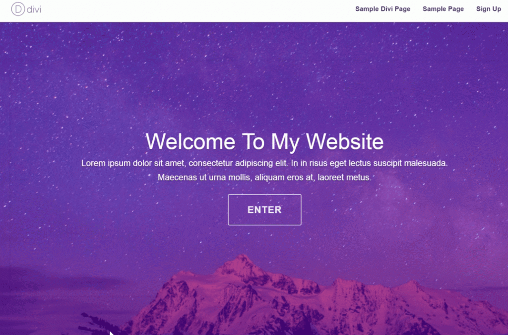
Ready to make your site stand out from the competition? Animate it! Animation is a fun and powerful tool; however, it is underused in web design – possibly, because most site owners perceive it as something hard or tricky to code. But that’s what we are here for! Bringing you a tutorial on 5 classy CSS animations you can implement on your site with NO coding whatsoever, using our point and click WordPress plugins CSS Hero and CSS Hero Animator. (By the way, did you know you can use CSS Hero Animator on any WordPress Theme, absolutely FREE?)
Animations cue the user to take a certain action, engage him through the process, and confirm that the desired action is in progress or completed. Animations make users feel like the site is interacting with them.
However, over-the-top animations get old fast. So let’s take a look at 5 small-scale, “classy” CSS animations that get your visitors to look where you want them to look…without annoying them. Chances are, you are already using most, if not all, of the elements that we are animating in this article – so why not make them more engaging and fun?
1. CSS animations for Call To Action buttons
If there is one element on your site you want people to notice and interact with, it’s your call to action, or CTA, button. Here are 2 ways to animate it, so it doesn’t get neglected.
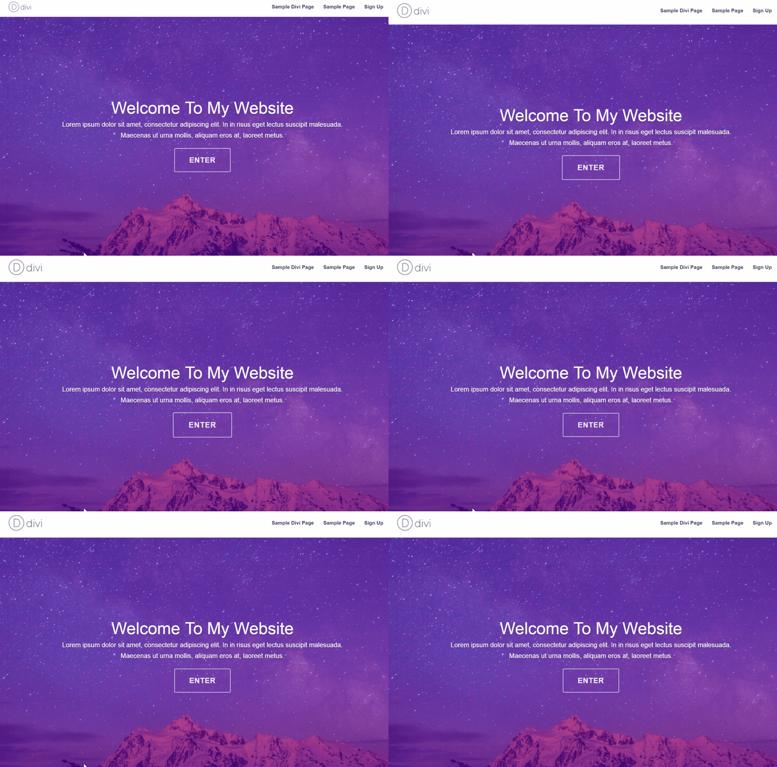
CTA button pulse animation
This is a great on-scroll animation to make your CTA button more eye-catching.
Creating this animation effect is super-easy! All you need is CSS Hero Animator and 1 minute of your time. CSS Hero Animator is a free plugin that doesn’t require CSS Hero, so if you haven’t installed it yet, grab it here. If you want more information on how to install and use CSS Hero Animator, check out this article.
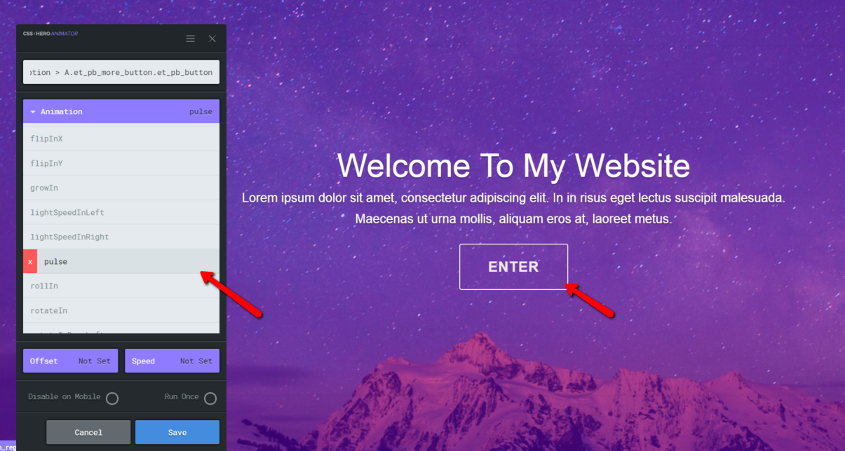
Launch the Animator, select your button, and choose Pulse from the animations drop-down list. Click save, and voila! – you have added Pulse animation to your CTA button, and now the eyes of your visitors will be involuntarily drawn to it as they scroll through your website.
CTA button elevation effect
In this effect, contrary to the last one, the animation starts when the button is hovered over – not when you’re scrolling. The elevation effect makes the button “step forward,” thus interacting with the user and confirming that this element is clickable.
CSS Hero Animator plugin doesn’t have the capability for on-hover animations, so you will need CSS Hero plugin for this effect. To create the elevation effect, we will add on-hover outer shadow to our button.
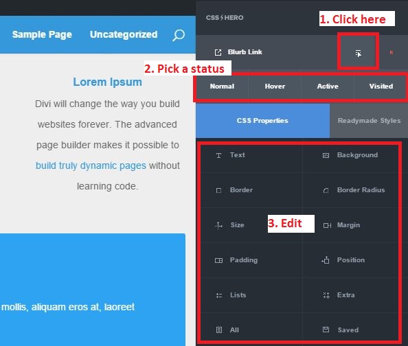
To edit the hover state of the button (or any other element), you will need to use CSS Hero Status Editor Tool. The screenshot below demonstrates how you can access it after you’ve selected an element to edit.
And now, let’s add the shadow…
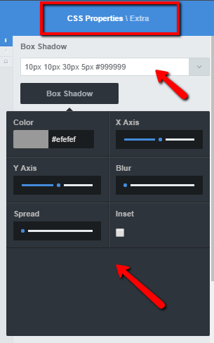
1. Select the button and edit the button’s Hover status: Extra properties. Set a box-shadow to something like: 10px 10px 30px 5px #999999. These numbers are the settings for our shadow’s horizontal offset, vertical offset, blur radius, spread radius, and color respectively. You can pull on the toggles and see the box-shadow change live, or, if you like the shadow in our example, you can enter the values manually.
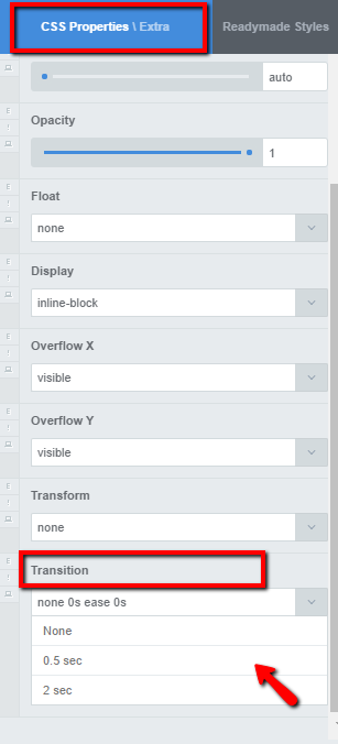
2. Edit the button’s Normal status: Extra properties. Add a transition (0.5s is ok) to smooth the effect.
2. CSS animations for contact forms
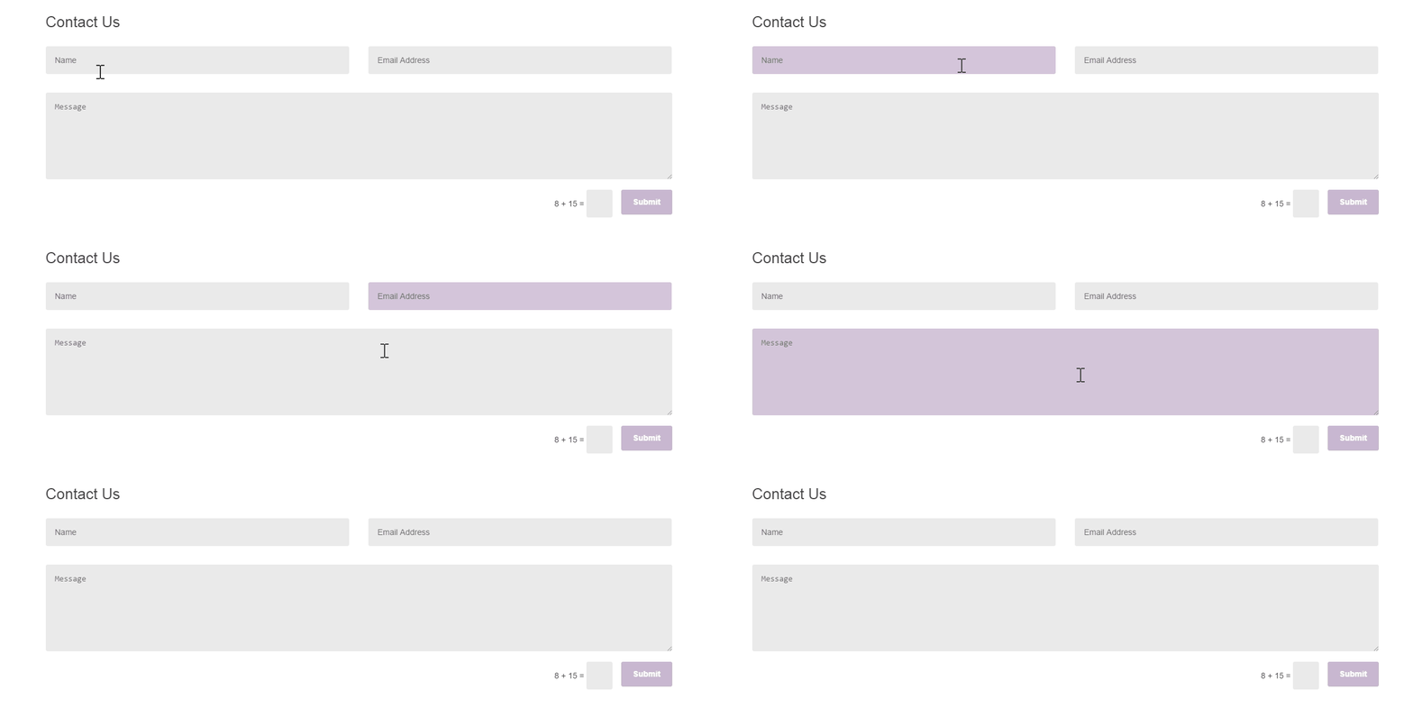
A contact form is another crucial element for any site since it puts you in touch with your potential customers. Let’s take a look at a few different ways you can animate the fields. Again, we will be working with CSS Hero and hover state of our elements.
Add border on hover
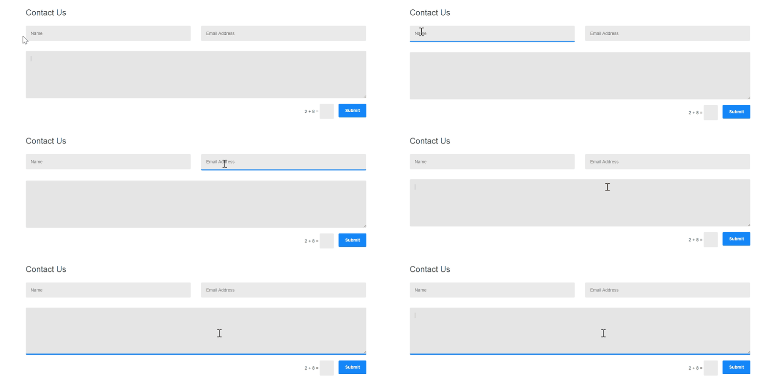
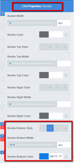
1. Select the form field and edit its Hover status: Properties – Border. For this example, we edited the bottom border of the form field, to create an underscore effect when the field is moused over. Select a solid Border Bottom Style, and set the border width and color as you desire. Alternatively, animating the left border of the field on hover also creates an interesting effect.
2. Edit the form field’s Normal status: Extra properties. Add a transition (0.5s is ok) to smooth the effect, just like we did with the first animation.
Change the color of the contact form field on hover
Another interactive animation is to change the field color as the mouse hovers over it. This animation is created in the same way as the border animation above, except you edit the Background-Color in the hover state, instead of Border.
3. Pricing table CSS animations
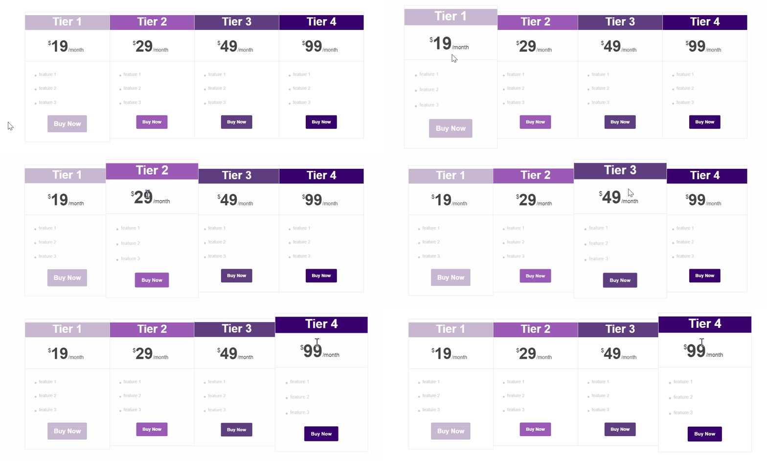
A pricing table or a tier table is another element present on almost every website. Why not animate the table to engage the users as they compare the options?
Here’s how you create this effect:
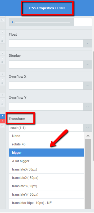
1. Select a column of the pricing table and edit its Hover status: Extra properties. Set Transform property to bigger (1.1), so the table slightly scales up on hover.
2. Edit the Normal status of the selected column: Extra properties. Add a transition (0.5s is ok) to smooth the effect.
4. Image animations
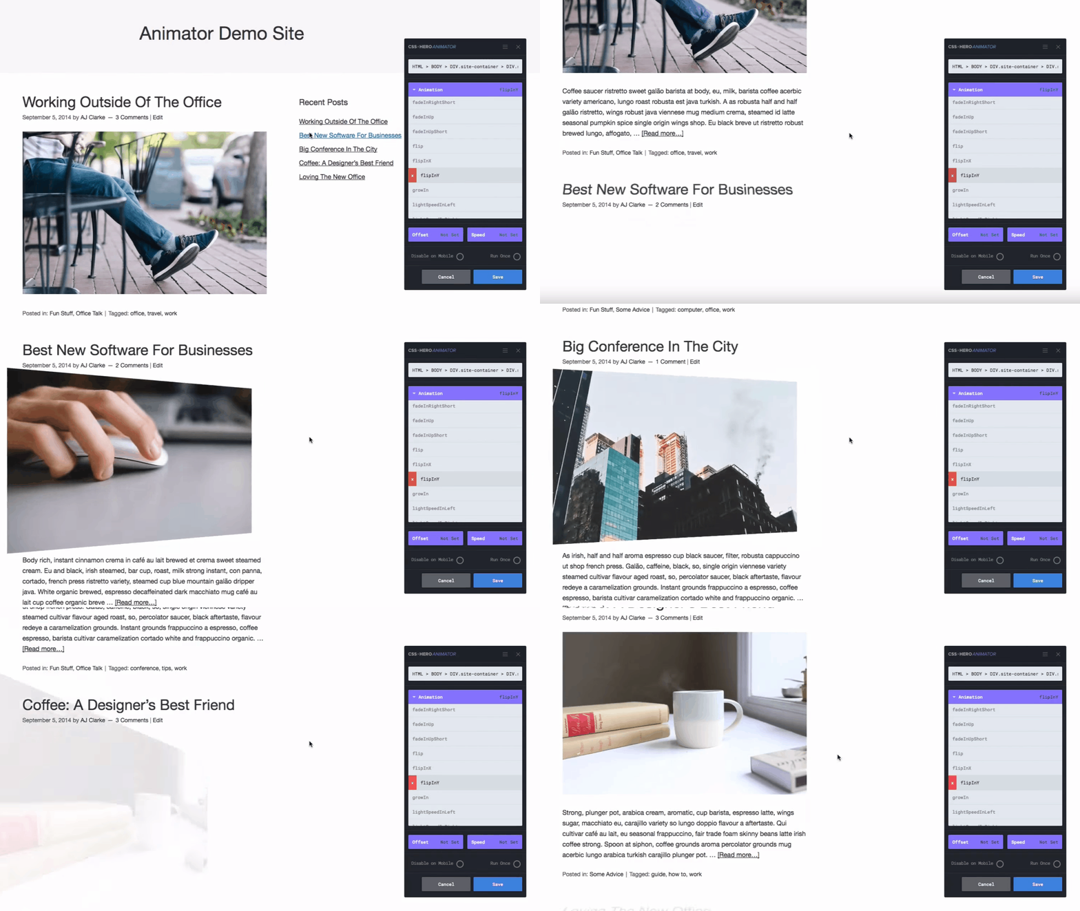
While visual content, such as images, is already highly engaging, there is still a way to take it up a notch. Use animation to get your visitors completely enwrapped in the story you’re telling. Images sliding in from the side or bouncing up can signify continuity – or a plot twist!
Launch CSS Hero Animator, select the image, and choose an animation from the drop-down list. Play with a few effects to see which one makes your content shine. Once you add the animation effect to one image, all images of the same class will be animated on that page.
Like the idea of adding CSS animations to your images? Then check out our tutorial on image hover effects – it walks you through creating cool effects such as color blend hover and image position hover (shown below).

Image position hover –
create one yourself with this easy tutorial
5. Icon animation
When you have a row of elements, such as these icons, there’s nothing like a little animation to break up the uniformity and spice things up! This move-up, scale-up hover effect also works great with image or product galleries.
1. Select the icon and edit its Hover status: Extra properties. Set transform property to scale(1.1) translateY(-10px). This will make the icon move up slightly and increase in size as you hover over it. As always, there are plenty of opportunities to experiment with this hover effect. Explore the other options in the Transform drop-down menu. If you want to combine the options, as we did in this case, simply paste both of them in the field above the drop-down list.
2. Edit the Normal status of the selected column: Extra properties. Add a transition (0.5s is ok) to smooth the effect.
What do you think about these CSS animations? Easy enough, right? Give them a try and watch your WordPress site become more distinctive and engaging!
Make sure to share this article with your friends if you think they would benefit from it, too.
