Let’s be honest here: If your offer is vague or just not appealing enough to your audience, a fancy call-to-action (CTA) button won’t save you. Many factors affect the success of the page, and a CTA button is just one of them. Still, the button is where all the action happens; that’s how your customers and subscribers connect with you. So Yes, it is absolutely worth it to spend a few minutes tweaking your CTA button with CSS Hero so that you can increase the conversions on that particular page.
Here are 5 design tips to make your CTA button more attractive, clickable and attention-grabbing.
High-contrast, standout color
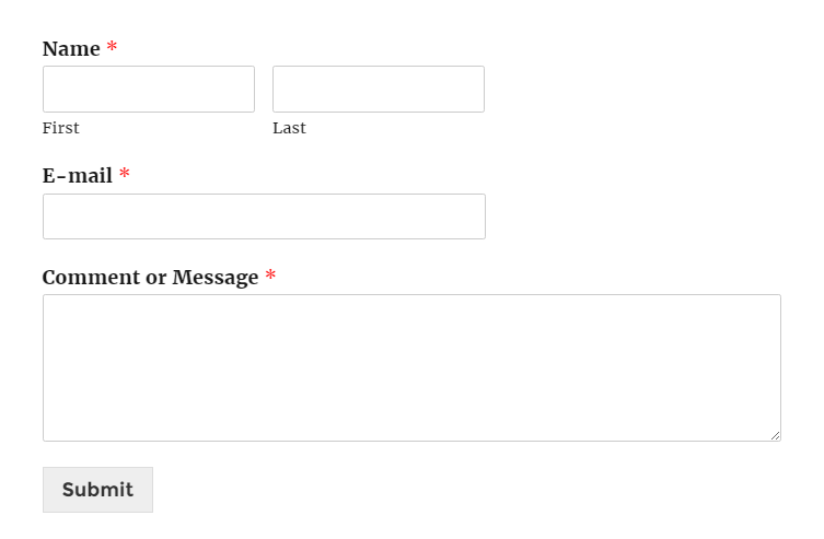
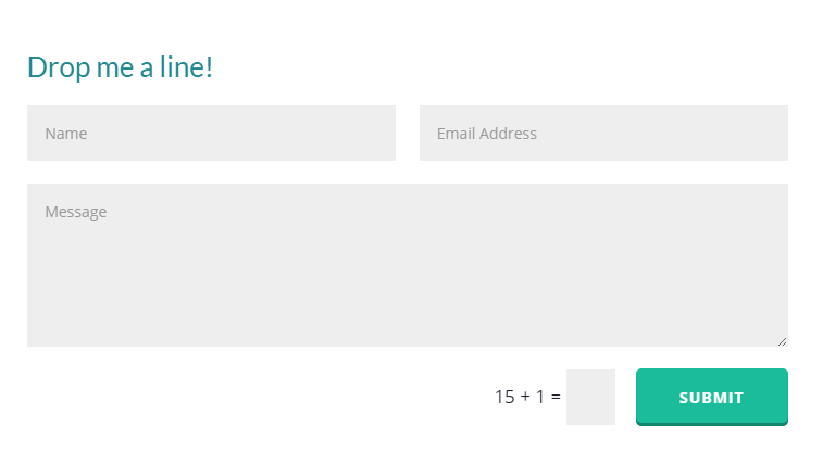
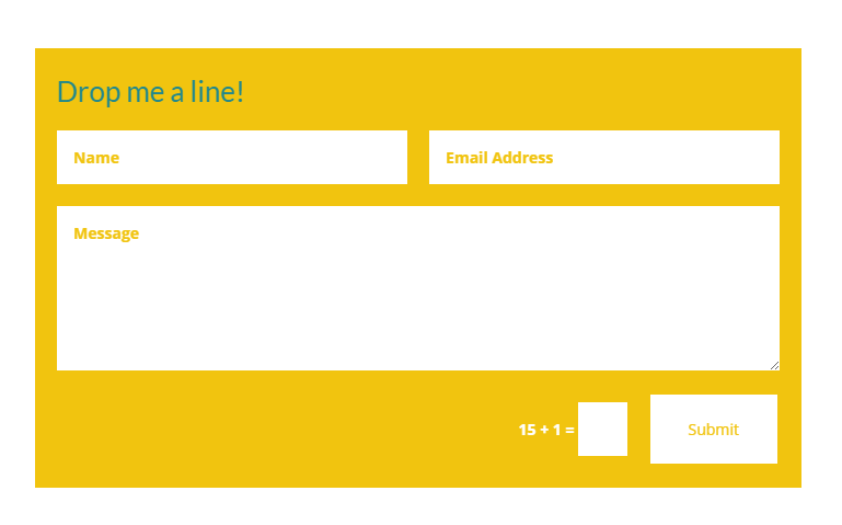
Often, the buttons that come with your theme or contact form plugins are just too plain. Their light gray appearance is like a conversion-preventing camouflage. For example, to which of the 2 contact forms below would you be more likely to submit your message and email?
As you can see, adding a little pop of color to the button or the whole form instantly makes it more noticeable. Still, it’s not just about using bright colors, but about using the colors that will stick out on your site. An orange button might be bright and attractive, but if your brand’s color scheme is orange, an orange CTA button will get lost in it. To make a button stand out in your typical color palette, go for the opposite color on the color wheel.
Change your CTA button color with CSS Hero
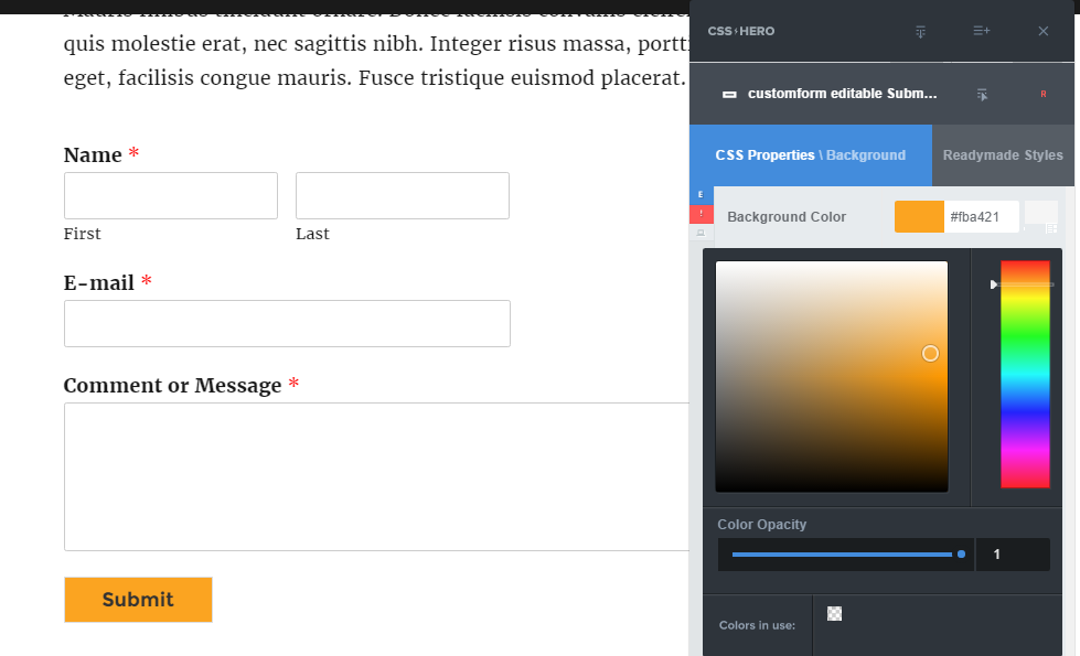
Select the button with the Selector tool (the blue spinning wheel), then go to CSS Properties – Background and play with colors to your heart’s content.
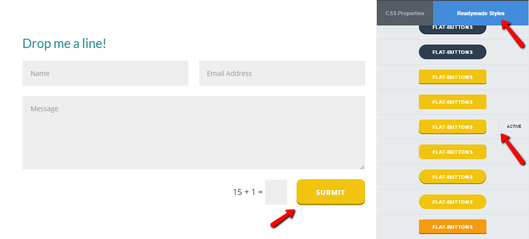
Also, don’t forget to check out CSS Hero’s Readymade Styles (available starting with CSS Hero 2.0) for hundreds of button and form styles ready to be applied on the fly.
Animation
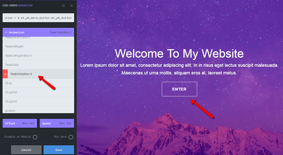
Aside from color, animation is another powerful way to make a button stand out on a page, as our eyes are involuntarily drawn to movement. You can add fast and lightweight CSS animations to your CTA buttons using our free plugin, CSS Hero Animator.
Depending on your brand and audience, you can go for bold CTA button animations such as ShakeUp or Wobble, or for subtle ones, such as FadeInUpShort or GrowIn. Either way, animation helps draw attention to your call-to-action buttons.
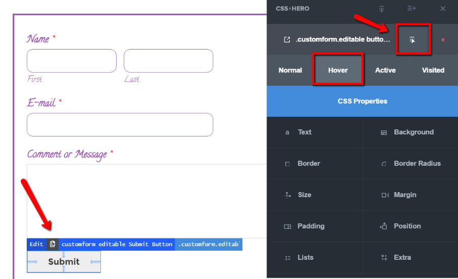
CSS Hero Animator runs parallel to CSS Hero plugin and creates on-scroll animations. If you prefer hover animation, that effect is easily achieved with CSS Hero. You can make your button change color, size or position on hover, throw a shadow, and more.
Check out our detailed tutorial on hover effects. Below is a screenshot showing how to access CSS Hero Status Editor Tool.
Non-competition
Your call-to-action button shouldn’t compete for users’ attention with other elements on the page. When faced with multiple choices, we get confused or distracted and don’t take any action at all. In most situations and especially on your landing pages and sales pages, you want to have only one call-to-action button on the page, so it’s extremely clear to visitors which action to take.
However, sometimes you need to have more than one CTA button – a common situation for a homepage, for example. In that case, make the button for the high-priority action more attractive and noticeable than the other buttons.
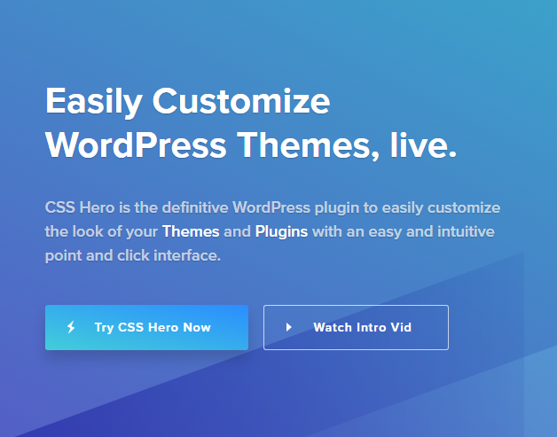
For example, when you land on CSS Hero homepage, we want you to take Hero for a spin right away – that’s why “Try CSS Hero Now” button has a brighter, more attractive color than the ghost button for the Intro Video.
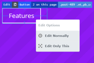
Use the new Edit only this feature (available from CSS Hero 2.3), so the changes you make to one button don’t affect your other CTA buttons.
Logical button placement
Keep your CTA buttons above the fold, and in a place users expect them to be. If you are describing the benefits of your hot-stuff freebie, the CTA button to download the freebie should be directly below the benefits description. Not to the side. Not a link in the text. Place a colorful, can’t-miss-it button right in the path of your visitors’ eye gaze.
Follow the natural hierarchy, and position your more important items and CTA buttons to the left. On the example above, the high-priority “Try CSS Hero Now” button is placed left for a reason – our eyes naturally move from left to right, so the important button will be the first one they see.
Modern drag-and-drop page builders, such as Beaver Builder, Elementor, Visual Composer and others give you plenty of control over the structure of the page and button placement. The plugins we just mentioned are all fully compatible with CSS Hero, so once you set your button in the perfect place, it’s ready for styling.
Size
If your button is minuscule and understated, it may go completely unnoticed, even if placed right. If you feel like color and/or animation alone is not enough to draw attention to your CTA button, increasing its width or height is your next move. Most contact form builders don’t give you the option to change your button size, but despair not, it is easily done with CSS Hero.
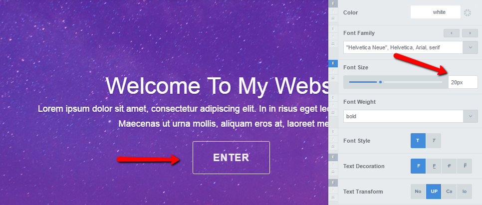
To start, increase the Font Size on your CTA button and see if it makes it pop. Test out the Text Transform option as well – often, all CAPS improve a button’s look and readability.
Next, experiment with Size properties and find the width and height to finally turn your button into a click magnet. However, exercise caution with this feature as making drastic size changes can disrupt your theme’s mobile layout. To prevent that, switch on “Desktop Only” toggle (highlighted on the screenshot below) or, instead of pixels, use relative CSS units (viewport units, percentage, em or rem).
Final word: Don’t settle for boring, ho-hum call-to-action buttons. CSS Hero gives you about a million ways to spice them up! Use these 5 easy to implement design tips to up your conversions and revenue.
Got friends who are tired of default WordPress styles and need a button makeover? Share this article with them. They’ll thank you for this no-code solution to their design problems.
