As far as page builder plugins go, Visual Composer by WP Bakery is one of the most popular out on the WordPress market today.
Not only does the plugin come with the ability to build and edit your pages in both the back-end and front-end of your WordPress site, but the plugin is so popular that there is a huge number of growing add-ons for Visual Composer that allow just about anyone to build dynamic web pages with ease.
For as wonderful as this plugin is, though, it is still very limited in the control it gives to the CSS within the elements that you create on the page.
Thankfully, when teamed up with CSS Hero, the Visual Composer’s CSS elements are super simple to edit in order to make certain things stand out.
As many marketers know, it’s important to include attractive Calls To Action in order to increase your conversion rate on your site. And, even though the VC plugin makes it easy to create one, CSS Hero can really make it pop.
Here’s how.
Make Your Visual Composer CTA Pop Using CSS Hero
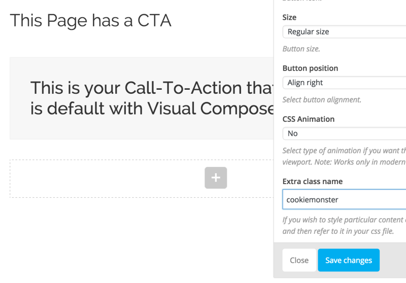
For this little walkthrough, I’ve used the first CTA option in Visual Composer and left everything set to the default settings for the CTA block. That way, there is no additional and unnecessary code to mess with. As you can see, the result of the VC default Call To Action block is nothing to jump up and down about…

Now let’s use CSS Hero to make it shine! Here’s what we are going to add and edit:
- Button color and text
- Change the hover action of the border
- CTA text font and font color
- Add a Border to the CTA
To do this, we need to start by adding an Extra Class to the block.
With VC launched (either in the back-end or the front-end), hover over the CTA block (or any other element for that matter) to bring up the settings for it. A little green popup box will appear. Click on the pencil.
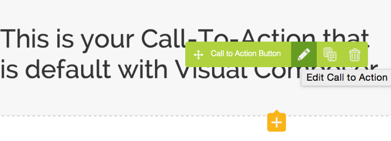
This will launch the same box that was used to create the CTA block.
Scrolling down in that box will show the option to add an Extra Class Name to the CTA. Any name can be added here, so I chose the name Cookie Monster because… I love cookies (don’t judge me.)
After saving the Extra Class name and with CSS Hero launched, I click on the CTA button (which is now defined as CTA Cookiemonster when using the CSS Hero Inspector) and I can start editing. From here, I quickly change the button’s color and font, and then save it.
Here is the result.

For an extra touch of something special, I also edited the button’s hover action so that the shape of the button changed slightly. I did this by selecting the CTA button, clicking the Edit Status button in CSS Hero and then selecting Hover. I tweaked the radius slightly and saved the changes. Here is the result of the button’s action when a mouse hovers over it.
Now for the text within the CTA block.
To do this, I select the CTA H2 Heading element and quickly make my changes. I chose a different font, font color and centered the text. Here is the result after I’ve changed the font family of the element’s text and its color.

Now I use CSS Hero to choose the entire CTA block. I choose the Border option in the live editor and go on to changing things up a bit.
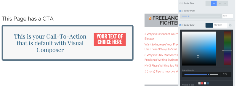
For this element, I choose to edit the border width and color, color opacity, and border-radius. Here is the before and after of the CTA block.
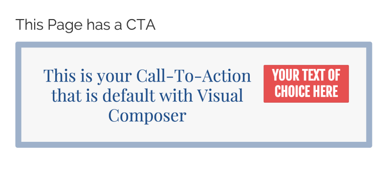
After
From here on out, whatever CTA block using Visual Composer that I create will have this look to it. The only things that will change are the text and button content and where a button-click will take me or a viewer.
Please watch also this how to video:
This is just one simple example of what you can do to the Call To Action block and what you can do when you team up Visual Composer with CSS Hero.
We’re going to be adding more content to our blog here on CSS Hero, but we want to hear from you. What kind of blog posts would you like to see? Be sure to let us know in your comments below and your idea or question may be in one of our next blog posts!

