Ever spent hours obsessing over which colors to pick for your site? (and whether or not they even go together) In that case, consider a monochromatic website design. A monochromatic palette is easy to use, and there is less chance that the colors will clash. An extra perk of a monochromatic site design is a clean, harmonious look that lets your content stand out. So if you enjoy elegant simplicity, launch your CSS Hero plugin, follow the tips below and let’s create a stunning monochrome look for your WordPress theme, shall we?
So where do you start with monochromatic website design?
First off, pick a base color – a single hue that will be used in your design. The rest of the color palette will be derived from this hue. The base color can be your brand color or a color that contrasts with it.
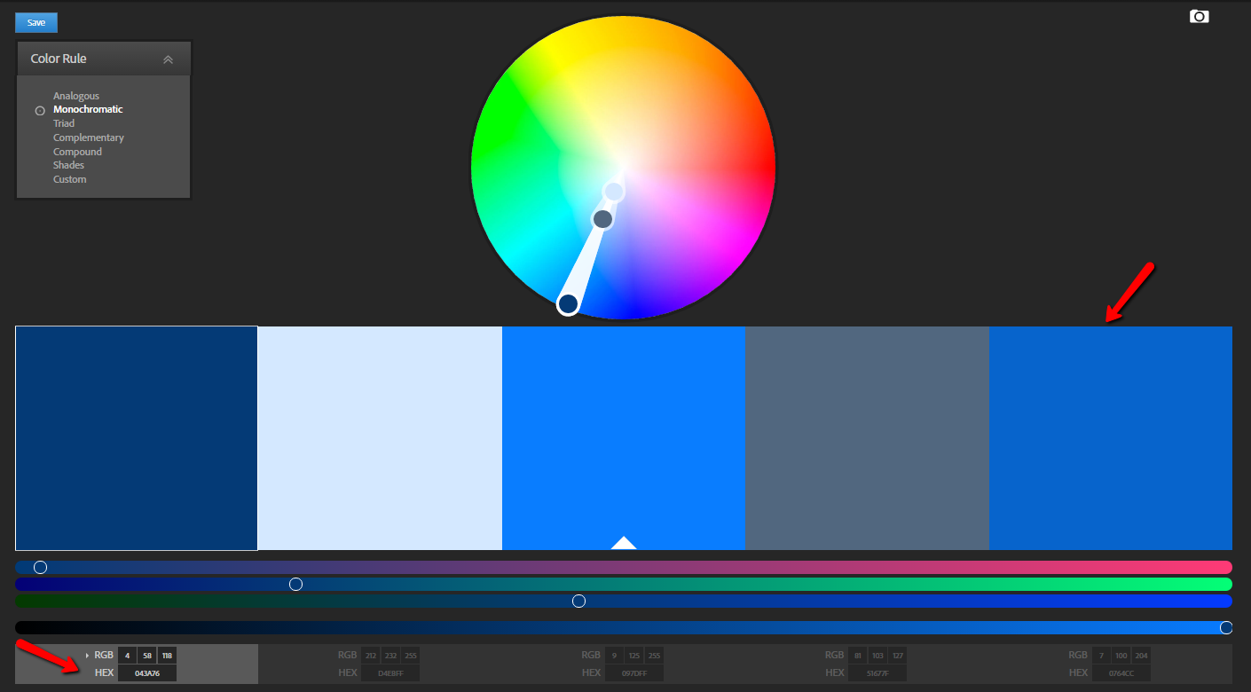
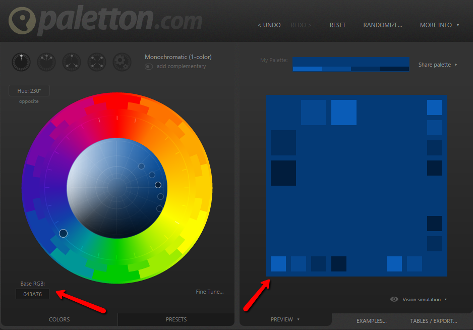
The biggest consideration with the monochromatic design is achieving a sharp enough contrast, so the different elements don’t blend. Your palette will need to include darker and lighter derivatives from the chosen hue. Base color darkened with black is called a shade, and base color lightened with white is called a tint. You can generate the shades and tints of your base color with free tools like Paletton and Adobe Color CC. With both tools, you put in the code of your base color and then play with toggles to create the palette.
As with any color palette, you have to define how each color variation will be used on your site. To ensure continuity of your design over time and across your team members, record color usage in your style guide.
Style your website in monochromatic colors with CSS Hero
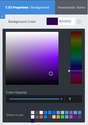
Target an element, head over to Properties – Background, and type in the color code from your palette. As you style the page and see the changes live, you may need more contrasting combinations. In that case, play with CSS Hero Color Picker to discover additional shades and tints. Try them out in real time, and see what looks best in the context of your theme and site.
CSS Hero has an auto-learning palette, so once you use the color, CSS Hero stores your selection, and you can easily use it next time from “Colors in use” section below the color picker.
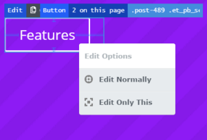
If you have more than one element of the same class on a page (multiple forms or call to action buttons, for example) and want to style them in different monochromatic colors, use the new Edit Only This option, implemented in CSS Hero 2.3.

With the new Edit Only This option, you can easily apply different styles to the elements of the same class, such as buttons, for example
Using a scale of monochromatic colors and “Edit Only This” option, you can depict progression, like on the price table below, for example. The same hue makes it clear that the items are related, but the shades show the progression as color intensity increases along with the price.
Monochromatic photography
You can go for a sophisticated monochromatic look even if your site’s design centers around photography. The answer is simple: Color overlay.
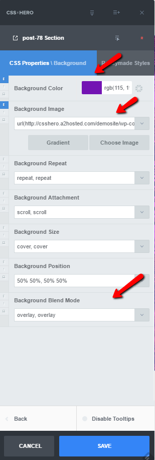
Launch CSS Hero and add a color overlay to your image in 4 simple steps:
- Target the element where you want to feature an image – your hero image, content card, portfolio items, etc.
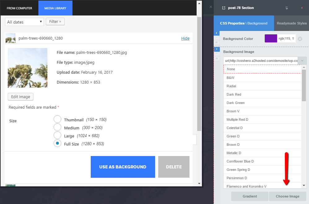
- Go to Background – Properties and add a Background Image.
3. Choose a Background Color:
You can even overlay a linear or radial gradient:
4. Set the Background Blend Mode to Overlay
Have these tips and examples inspired you to try the monochromatic look? It’s easy-to-implement, yet sophisticated. If you are in love with minimalist styles, or just can’t get enough of your brand color, try your hand at monochromatic website design with CSS Hero! Your WordPress theme will look sleek as ever.
Psst. Share this article with your friends if you think they might find it useful.

