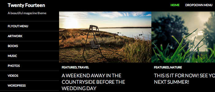
2014 was a great year in general, but it was an especially good year for WordPress.
Back in 2010, the minds behind WordPress.org began releasing Themes that carried the name of that year. And up until 2014, the themes they created were solely blog style themes with a slim margin for anything else. However, the Twenty Fourteen theme changed all of that.
Instead of utilizing whitespace or earthy colors, the 2014 WordPress Theme lays claim to the dark side of design in a magazine type of layout.
Aesthetics put aside; the Twenty Fourteen WP Theme has quite a lot to like about it.
Top Features of the WordPress 2014 Theme
Crisp and Clean Typography
Though utilizing a dark color scheme, the twenty fourteen theme makes sure not to go overboard in its design. The theme uses the Google Font, Lato, by default and keeps its typography clean and readable.
Left Sidebar
Placing the sidebar to the left is nothing new in the WordPress world, but it does add a certain element that’s refreshing to the average blog these days. The widget placement there and throughout the theme allows for some easy layout customizations.
Easily Display Featured Content
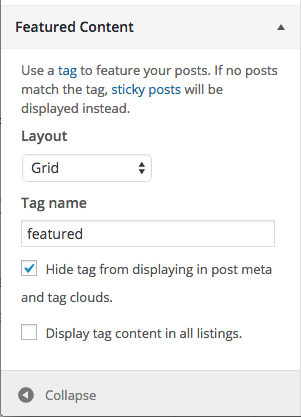
One of the coolest features about the 2014 WordPress theme is how easy it is to display your featured content. With the option in your WP Customizer, you can choose to display a featured category in either a grid or slider layout.
Translation Ready; RTL Support
Another fancy feature is the fact that the 2014 theme was truly made for everyone. It can be used for your website no matter what language your write in and even supports Right to Left languages.
Mobile Friendly
Although Twenty Fourteen is designed with a fixed width, the theme still stays ahead of the curve by being mobile friendly. Check it out in our live demo. Simply resize the browser window and view the theme in its various smaller sizes.
How to Make the Twenty Fourteen WordPress Theme Stand Out
As a free theme, this WordPress theme has a lot of default features and almost no customization options. That can be kind of a bummer for those of you who wish to use the theme but want to put a unique twist on it.
For most users, however, making any type of visual change to a theme requires code and most people simply don’t have the knowledge to execute that code.
That is one of the many reasons why we’ve tireless been working on our plugin, CSS Hero.
With CSS Hero, you don’t need any coding knowledge to make visual changes to your theme. If you can click a computer mouse, then you can use CSS Hero.
That’s the beauty of our plugin:
We took something rather difficult — CSS — and made it so easy to change that anyone could to it.
With over 1 million downloads, we know that the 2014 WP theme is one that people want to use and create their websites with. As that is the case, we made sure to make CSS Hero completely compatible with the theme.
What does that mean?
It means that you can easily use our plugin to customize nearly every single element of the 2014 theme — an astounding 90% of it is completely editable!
Just take a look below at some of the things that you can do. Want to give CSS Hero a test run? Just click on the Launch button below and take our plugin for a spin!
If you use (or plan to use) this Theme...CSS Hero can help you deeply and quickly customize the Twenty Fourteen Theme, solving some common issues like:
- How to customize fonts in the Twenty Fourteen WordPress Theme, to make font biggers or change typeface for titles and header texts
- How to change CSS background image on the Twenty Fourteen WordPress Theme and build background fades
- How to change colors and styles on Twenty Fourteen WordPress Theme
- How to change size of page width
- How to change CSS style of top navigation buttons
- Customize the CSS style of navigation menu on the Twenty Fourteen Theme
- How to customize the footer on the Twenty Fourteen WordPress Theme

